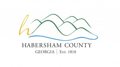
Habersham County officially has a new calling card. On Thursday, county commissioners approved a new logo, basically a cursive h with squiggles to imply mountains, for use on stationery, department vehicles and the county website.
No one on the board said they “loved” the new design. It was more a case of “this’ll do.”
Commissioner Natalie Crawford says picking a logo is tough because you’re never going to hit on one that everybody loves. “For those of us who live here or grew up here, Habersham is our home. There’s not a logo that could capture everything that Habersham is to us.”

This logo was created by Archway Partnership students at the University of Georgia. It was the favorite of four reviewed by the county’s “planning and visioning group” a couple months ago but was reworked to include an additional squiggle (in blue on the color version) to represent the Soque River. The final product was presented to commissioners this week.
Crawford, a marketing professional by trade, says the new logo’s simplified design is just the starting point. The county will need to imbue it with meaning over time. “Just like with Coca-Cola or any other brand or logo that you see, it becomes what we make it. It becomes the spirit that we put behind it and the message that we pair with our logo every time it’s in front of someone. That’s how it becomes a brand.”
County Commissioners will now begin work on a timetable to roll out the new design and retire the current logo.


