Athens, Ga. – Are you more likely to die from COVID-19 or in a car accident? A new risk assessment tool can help you figure that out.
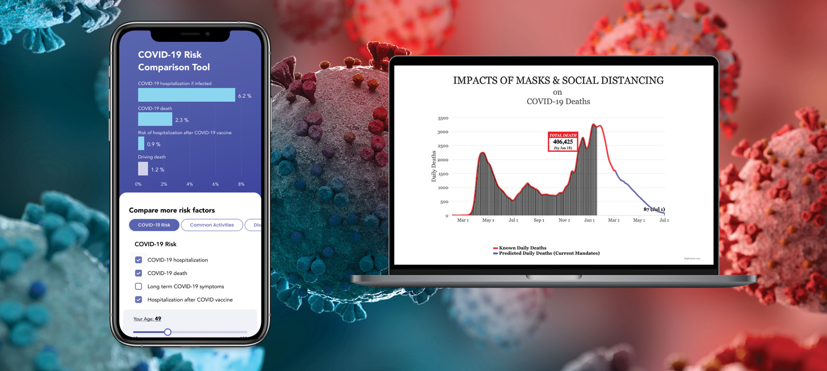
Created by Cameron Byerley at the University of Georgia, the online tool is called COVID-Taser, and it allows users to adjust age, vaccine status and health background to predict the risks of the virus.
Byerley, an assistant professor in UGA’s Mary Frances Early College of Education, says that most people assess risk based on their experience of the world.
“Like if you’re trying to decide how dangerous it is to drive, you might think about how out of all your friends and all your family members, you know two people who died of driving in the past 20 years. So, it’s risky enough that you should wear a seatbelt and drive sober, but it’s not so risky that you shouldn’t drive to a friend’s house.”
That way of thinking helps people compare unknown risks with known ones they interact with every day. The COVID-Taser capitalizes on those comparisons to give people a better idea of their risks of dying from COVID-19 or having adverse side effects from vaccination. Website visitors can then see how those risks stack up to others like dying in a car crash or being struck by lightning in their lifetime.
Sponsored by a Rapid Grant from the National Science Foundation, the website is part of a larger project that aims to investigate how people interpret media using quantitative data representations like graphs and charts.
Understanding health risks
After conducting surveys in both the U.S. and South Korea, the team created several tools and a series of K-12 lesson plans to help citizens and students use mathematical representations of COVID-19 to make data-informed decisions about their health.
“A big focus of the project is thinking about how to communicate information,” says Byerley. “We’re really interested in risk communication and providing information so people can make decisions for themselves by comparing COVID risks and vaccination risks to more familiar risks they have a sense of.”
People can also use the Relative Risk Tool to toggle between different ages to see how the risk of being hospitalized or dying from COVID-19 changes according to age groups.
Additionally, the tool can be used to compare the risk of dying from the coronavirus for vaccinated people versus unvaccinated people, as well as unvaccinated people with various health conditions like rheumatoid arthritis, lupus, psoriasis and other immunosuppressive conditions.

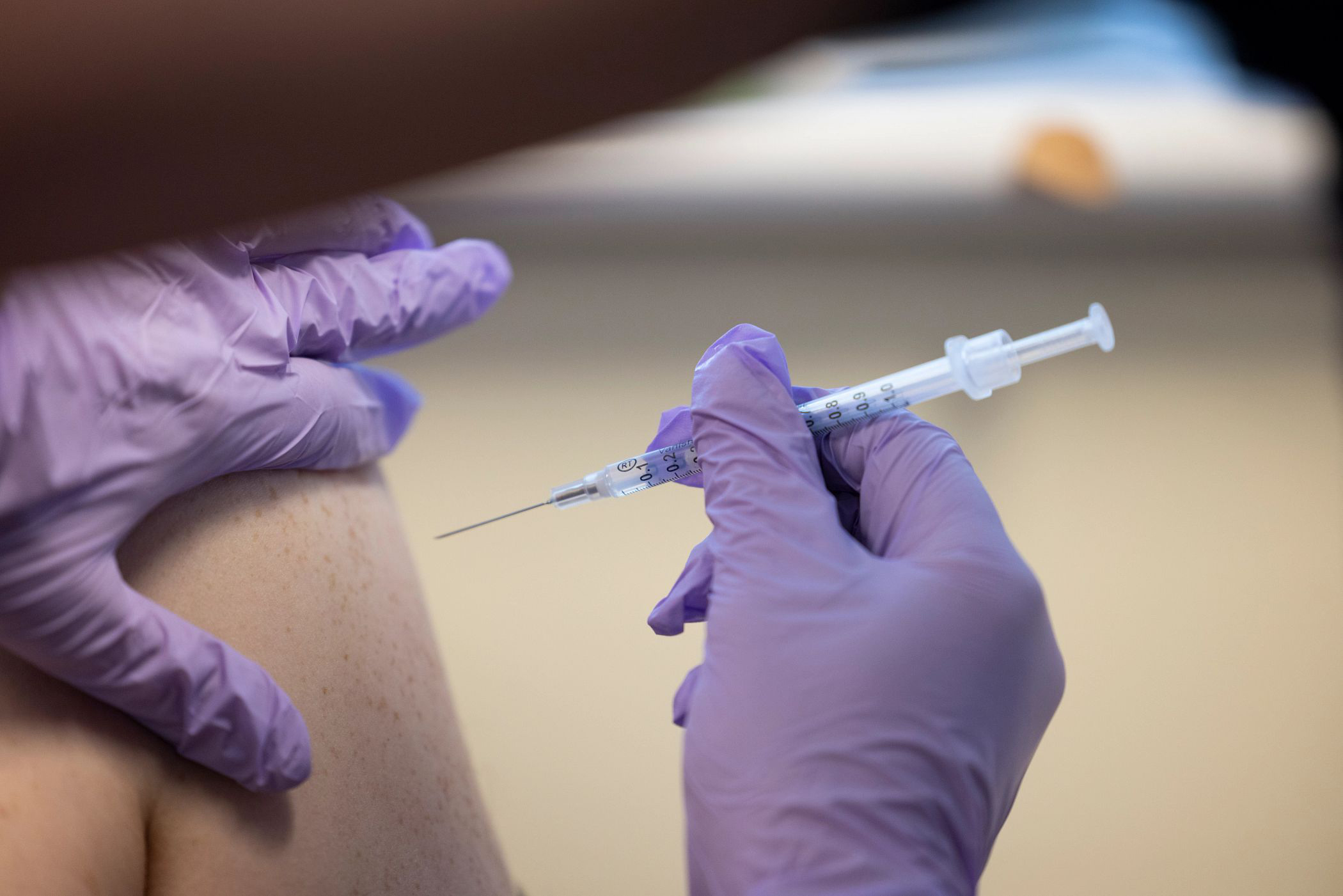
“My dream goal is that people will see that the risk of vaccination is low compared to other risks that they’re willing to take,” says Byerley. “They’ll see that vaccination is safer than driving, pregnancy, playing professional soccer and just safer than lots of things they’re willing to do already. It’s also far, far safer than getting a COVID infection … the benefits of vaccination far outweigh the risks.”
Byerley is currently working on incorporating information on immunocompromised people who are both vaccinated and unvaccinated into the Relative Risk Tool.
Explaining the impact of masks, social distancing
COVID-Taser’s projection tool, which was designed to explain models from the Institute of Health Metrics and Evaluation (IHME), is an educational resource that teaches people the difference between cumulative deaths, which is the total number of people who have died and a figure that will always increase over time, and average daily deaths, which can increase or decrease over time.
Byerley noted that media outlets cause confusion when they include graphs labeled “total deaths” with numbers decreasing over time when they really should be labeled “average daily deaths” because total deaths cannot decrease.
In addition to showing total deaths and daily deaths separately on the projection tool, IHME models also predict how deaths will either increase or decrease in the U.S. depending on whether mask mandates are implemented.
“We want people to understand what a model is and how it’s kind of like what happens on your phone when you’re using Google Maps to predict how long a trip will take, which is based on some sort of algorithm,” says Byerley. “It’s usually pretty good, but it’s never perfect and it changes. So we want people to understand that epidemiological modeling is very helpful, even though those estimates aren’t perfect. They still help people plan and are helpful tools.”
The IHME model predicted that, during the middle of the pandemic, areas without mandates involving masks, large gatherings and shutdowns would likely experience an increase in daily deaths. On the other hand, if mask mandates were implemented across the entire U.S., the model predicted that daily deaths would decrease. These predictions were verified by varying death rates in states and other countries with different public health policies.
Although models are not exact, they still show the impact of masking and vaccination in reducing death from COVID-19, Byerley says.
“I’m hoping these tools can serve as a template for medical communication,” he says. “And when numbers are hard for people to understand, it helps them see the relative size of things even if they don’t know percentages or place values or information like that from school. I want these tools to help people understand that the risk of COVID infection is worse than the risk of vaccination and that the risk of vaccination is lower than other things they already do.”


